CSS – @ Rules
Certainly! In CSS, “@ rules” are special instructions or directives used to define various aspects of a style sheet. They play a crucial role in controlling how styles are applied and can include specific rules for media queries, animations, and more.
Here are some common “@ rules” in CSS:
1. @media: The “@media” rule allows you to apply styles conditionally based on the characteristics of the user’s device, such as screen size, resolution, or orientation. It’s essential for creating responsive web designs.
Example :
In HTML and CSS, the @media rule is used to apply styles based on the characteristics of the device or viewport, such as screen width, height, or orientation. This is commonly used for creating responsive designs. Here’s an example of how to use the @media rule in an HTML document:
<!DOCTYPE html>
<html>
<head>
<style>
/* Regular CSS styles for the body */
body {
font-family: Arial, sans-serif;
background-color: #f0f0f0;
color: #333;
margin: 0;
padding: 0;
font-size: 16px;
}
/* Media query for screens with a maximum width of 600px */
@media screen and (max-width: 600px) {
body {
font-size: 14px;
}
h1 {
font-size: 24px;
}
}
/* Media query for screens with a minimum width of 1200px */
@media screen and (min-width: 1200px) {
body {
font-size: 18px;
}
h1 {
font-size: 36px;
}
}
</style>
</head>
<body>
<h1>@media Example</h1>
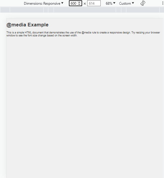
<p>This is a simple HTML document that demonstrates the use of the @media rule to create a responsive design. Try resizing your browser window to see the font size change based on the screen width.</p>
</body>
</html>Code language: HTML, XML (xml)Output :
In this example:
- We have a basic HTML document with a heading (
<h1>) and a paragraph (<p>). - Inside the
<style>element, we define the default styles for thebody, including font size. - We use
@mediaqueries to apply different styles based on the screen width. When the screen width is 600 pixels or less, the font size is reduced to 14px, and the heading (<h1>) font size is adjusted to 24px. When the screen width is 1200 pixels or more, the font size is increased to 18px, and the heading font size is adjusted to 36px.
As you resize your browser window, you’ll notice that the font size of the content and heading changes based on the screen width, demonstrating how the @media rule can be used for responsive design.
2. @font-face: This rule is used to define custom fonts for use in web pages. It allows you to specify font files and their properties, enabling the use of non-standard fonts.
Example :
The @font-face rule in CSS allows you to define custom fonts and use them in your web pages. Here’s an example of how to use the @font-face rule in an HTML document:
<!DOCTYPE html>
<html>
<head>
    <style>
        /* Define a custom font using @font-face */
        @font-face {
            font-family: "CustomFont"; /* The name of the font */
            src: url("custom-font.woff2") format("woff2"), /* Font source in WOFF2 format */
                 url("custom-font.woff") format("woff"); /* Font source in WOFF format */
            font-weight: normal; /* Font weight (normal) */
            font-style: normal; /* Font style (normal) */
        }

        /* Apply the custom font to an element */
        .custom-font-text {
            font-family: "CustomFont", Arial, sans-serif;
            font-size: 24px;
        }
    </style>
</head>
<body>
    <h1>@font-face Example</h1>
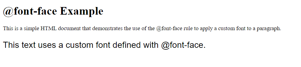
    <p>This is a simple HTML document that demonstrates the use of the @font-face rule to apply a custom font to a paragraph.</p>
    <p class="custom-font-text">This text uses a custom font defined with @font-face.</p>
</body>
</html>Code language: HTML, XML (xml)
Output :
In this example:
- We define a custom font using the
@font-facerule. Thefont-familyproperty specifies the name of the font, and thesrcproperty specifies the font source files in WOFF2 and WOFF formats. You should provide the actual file paths to your font files. - We specify
font-weightandfont-styleasnormalto indicate that this is a regular (non-bold, non-italic) font. - We apply the custom font to an element with the class
.custom-font-text. We also set the font size to 24px for this element.
When you open this HTML file in a web browser, you will see that the text within the paragraph with the class .custom-font-text is displayed using the custom font defined with @font-face. This demonstrates how to use @font-face to include and apply custom fonts in your web pages. Please make sure to replace the font file paths with the actual paths to your custom font files.
3. @keyframes: The “@keyframes” rule is crucial for creating animations in CSS. It defines the animation’s keyframes, specifying how an element should change over time.
Example :
The @keyframes rule in CSS is used to create animations by specifying how an element should change over a set of frames. Here’s an example of how to use @keyframes in an HTML document to create a simple animation:
<!DOCTYPE html>
<html>
<head>
    <style>
        /* Define a @keyframes animation */
        @keyframes bounce {
            0% {
                transform: translateY(0); /* Initial position */
            }
            50% {
                transform: translateY(-30px); /* Halfway point, element moves up */
            }
            100% {
                transform: translateY(0); /* Return to the initial position */
            }
        }

        /* Apply the animation to an element */
        .animated-element {
            width: 100px;
            height: 100px;
            background-color: #336699;
            animation: bounce 2s ease infinite; /* Apply the "bounce" animation */
        }
    </style>
</head>
<body>
    <h2>@keyframes Animation Example</h2>
    <div class="animated-element"></div>
</body>
</html>Code language: HTML, XML (xml)
Output :
In this example:
- We define a
@keyframesanimation called “bounce” that specifies how an element should change over a set of frames. In this case, the animation moves an element up and down by changing itstransformproperty. - Inside the
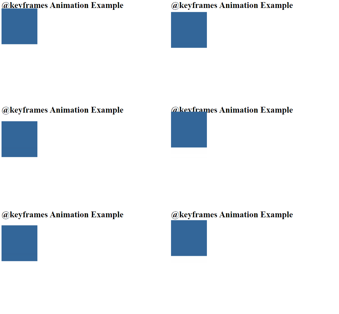
@keyframesrule, we define keyframes at 0%, 50%, and 100% of the animation’s duration. At 0%, the element is at its initial position. At 50%, it is halfway up. At 100%, it returns to the initial position. - We apply the animation to an element with the class
.animated-element. We set its width, height, background color, and use theanimationproperty to apply the “bounce” animation. The animation lasts for 2 seconds, has an easing effect, and repeats infinitely.
When you open this HTML file in a web browser, you will see a square element with a bouncing animation. This demonstrates how to use @keyframes to create a simple animation in CSS. You can customize the keyframes and animation properties to create more complex animations.
4. @import: This rule lets you import an external style sheet into another style sheet, allowing for better organization and modularization of styles.
Example :
The @import rule in CSS is used to import an external style sheet into another style sheet. Here’s an example of how to use @import in an HTML document to import an external CSS file:
Let’s assume you have an external CSS file named “external-styles.css” with the following content:
/* external-styles.css */

/* Define styles for a class */
.my-class {
    color: blue;
    font-size: 18px;
}Code language: CSS (css)
Now, you can create an HTML document and use the @import rule to include this external CSS file:
<!DOCTYPE html>
<html>
<head>
    <style>
        /* Use @import to include an external style sheet */
        @import url("external-styles.css");

        /* Regular CSS styles for the body */
        body {
            font-family: Arial, sans-serif;
            background-color: #f0f0f0;
            color: #333;
            margin: 0;
            padding: 0;
            font-size: 16px;
        }

        /* Apply styles from the external style sheet */
        .my-class {
            text-decoration: underline;
        }
    </style>
</head>
<body>
    <h2>@import Example</h2>
    <p>This is a simple HTML document that demonstrates the use of the @import rule to include an external style sheet.</p>
    <p class="my-class">This text uses styles from the external style sheet.</p>
</body>
</html>Code language: HTML, XML (xml)
Output :

In this example:
- We have an external CSS file named “external-styles.css,” which defines styles for a class called
.my-class. - In the HTML document, inside the
<style>element, we use the@importrule to include the external style sheet by specifying its URL. This imports the styles from “external-styles.css” into the current style sheet. - We then apply the imported styles to an element with the class
.my-class.
When you open this HTML file in a web browser, you will see that the text with the class .my-class has styles applied from the external style sheet, demonstrating how to use @import to include external styles in your HTML document.
5. @supports: The “@supports” rule checks if a particular CSS property or value is supported by the user’s browser. It’s useful for applying styles conditionally based on browser capabilities.
Example :
The @supports rule in CSS is used to apply styles only if a specific feature or property is supported by the browser. Here’s an example of how to use @supports in an HTML document:
<!DOCTYPE html>
<html>
<head>
    <style>
        /* Regular CSS styles for the body */
        body {
            font-family: Arial, sans-serif;
            background-color: #f0f0f0;
            color: #333;
            margin: 0;
            padding: 0;
            font-size: 16px;
        }

        /* Apply styles only if 'display: grid' is supported */
        @supports (display: grid) {
            /* Grid layout styles */
            .grid-container {
                display: grid;
                grid-template-columns: 1fr 1fr 1fr;
                grid-gap: 20px;
            }

            .grid-item {
                background-color: #336699;
                color: white;
                text-align: center;
                padding: 20px;
            }
        }
    </style>
</head>
<body>
    <h2>@supports Example</h2>
    <p>This is a simple HTML document that demonstrates the use of the @supports rule to apply styles only if the 'display: grid' property is supported by the browser.</p>

    <!-- Grid layout, only displayed if 'display: grid' is supported -->
    <div class="grid-container">
        <div class="grid-item">Item 1</div>
        <div class="grid-item">Item 2</div>
        <div class="grid-item">Item 3</div>
    </div>
</body>
</html>Code language: HTML, XML (xml)
Output :

In this example:
- We have a basic HTML document with a heading (
<h2>), a paragraph (<p>), and a grid layout (<div>elements). - Inside the
<style>element, we define the default styles for thebody, including font family, background color, text color, and font size. - We use the
@supportsrule to check if the browser supports thedisplay: gridproperty. If it does, we apply styles for a grid layout. If not, these styles are not applied. - Inside the
@supportsblock, we define styles for a grid layout usingdisplay: grid,grid-template-columns, and other grid-related properties.
When you open this HTML file in a web browser, you will see that the grid layout is displayed only if the browser supports the display: grid property. This demonstrates how to use @supports to conditionally apply styles based on browser support for specific features or properties.
6. @page: The “@page” rule defines the style for printed pages, allowing you to customize the appearance of printed documents.
Example :
The @page rule in CSS is used to define styles for printed pages. It allows you to specify how the content should be formatted when printed, including page margins, page size, headers, footers, and more. Here’s a basic example of how to use @page in an HTML document:
<!DOCTYPE html>
<html>
<head>
    <style>
        /* Define @page styles for printed pages */
        @page {
            size: A4; /* Page size (e.g., A4) */
            margin: 20mm; /* Page margins (top, right, bottom, left) */
        }

        /* Regular CSS styles for the body */
        body {
            font-family: Arial, sans-serif;
            font-size: 14px;
        }
    </style>
</head>
<body>
    <h2>@page Example</h2>
    <p>This is a simple HTML document that demonstrates the use of the @page rule to define styles for printed pages. When you print this page, the printed output will have the specified page size and margins.</p>
    <p>Lorem ipsum dolor sit amet, consectetur adipiscing elit. Nullam at velit ac nunc auctor volutpat.</p>
</body>
</html>Code language: HTML, XML (xml)
Output :

In this example:
- We have a basic HTML document with a heading (
<h2>) and paragraphs (<p>). - Inside the
<style>element, we define the@pagerule to specify the page size as “A4” and set the margins to 20 millimeters on all sides. - We also define regular CSS styles for the
body, such as font family and font size.
When you print this HTML document using a web browser’s print functionality, the printed output will follow the rules specified in the @page rule. In this case, it will have an A4 page size and 20mm margins on all sides. The content of the page will be formatted accordingly for printing.
Please note that browser support for all @page features may vary, and more advanced printing styles can be achieved by using additional CSS properties and features specific to printing.
7. @charset: This rule specifies the character encoding of the style sheet. It’s essential for ensuring correct text rendering, especially when dealing with non-ASCII characters.
Example :
The @charset rule in CSS is used to specify the character encoding of an external style sheet. It should be placed at the very beginning of the style sheet file, if used. Here’s how you can use the @charset rule in an HTML document:
Suppose you have an external CSS file named “styles.css” that uses the @charset rule to specify the character encoding:
/* styles.css */

@charset "UTF-8";

/* Other CSS rules follow... */
body {
    font-family: Arial, sans-serif;
    font-size: 16px;
    background-color: #f0f0f0;
    color: #333;
}Code language: CSS (css)
In this example, we’ve specified that the character encoding for this style sheet is UTF-8 using the @charset rule.
Now, you can include this external style sheet in your HTML document like this:
<!DOCTYPE html>
<html>
<head>
    <meta charset="UTF-8"> <!-- Set the document's character encoding -->
    <link rel="stylesheet" type="text/css" href="styles.css"> <!-- Include the external style sheet -->
</head>
<body>
    <h2>@charset Example</h2>
    <p>This is a simple HTML document that includes an external style sheet using the @charset rule.</p>
    <p>The styles in the external style sheet will be applied to the HTML content.</p>
</body>
</html>Code language: HTML, XML (xml)
Output :

In this HTML document:
- We set the document’s character encoding to UTF-8 using the
<meta charset="UTF-8">tag within the<head>section. This ensures that the HTML document is also encoded in UTF-8 to match the character encoding specified in the external style sheet. - We include the external style sheet “styles.css” using the
<link>element.
When you open this HTML file in a web browser, the styles from the external style sheet will be applied to the HTML content. The @charset rule in the external style sheet ensures that the CSS file is correctly interpreted with the specified character encoding.
8. @namespace: The “@namespace” rule is used for declaring XML namespaces in CSS. It’s primarily relevant for XML-based documents.
Example :
The @namespace rule in CSS is used to define a namespace for CSS selectors. It is typically used in combination with XML-based languages such as XHTML or SVG to specify which namespace the selectors apply to. Here’s an example of how to use @namespace in an HTML document:
<!DOCTYPE html>
<html xmlns="http://www.w3.org/1999/xhtml">
<head>
    <style>
        /* Define a namespace for SVG elements */
        @namespace svg url(http://www.w3.org/2000/svg);

        /* Apply styles to SVG elements within the specified namespace */
        svg|circle {
            fill: blue;
            stroke: black;
            stroke-width: 2;
        }
    </style>
</head>
<body>
    <h2>@namespace Example</h2>
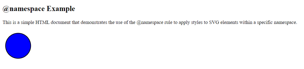
    <p>This is a simple HTML document that demonstrates the use of the @namespace rule to apply styles to SVG elements within a specific namespace.</p>

    <!-- SVG content within the specified namespace -->
    <svg xmlns="http://www.w3.org/2000/svg" width="100" height="100">
        <circle cx="50" cy="50" r="40" />
    </svg>
</body>
</html>Code language: HTML, XML (xml)
Output :
In this example:
- We have an HTML document with a
<head>section where we define a<style>element. - Inside the
<style>element, we use the@namespacerule to define a namespace for SVG elements. The namespace URL, in this case, is “http://www.w3.org/2000/svg,” which is the XML namespace for SVG. - We then apply styles to SVG elements within the specified namespace using the
svg|circleselector. This selector selects<circle>elements that are part of the SVG namespace. - In the HTML body, we include an SVG
<svg>element with a<circle>element inside it. Thexmlnsattribute specifies the XML namespace for the SVG content.
When you open this HTML file in a web browser, you will see an SVG circle with blue fill, a black stroke, and a stroke width of 2. The @namespace rule is used to target SVG elements within the specified XML namespace and apply styles to them. This example demonstrates how to use @namespace to apply styles to elements in specific XML namespaces.
These “@ rules” are essential for creating well-structured and responsive stylesheets. They provide the flexibility and control needed to adapt styles to different devices, conditions, and contexts, ultimately enhancing the user experience and design capabilities of web developers.
