CSS resize
In CSS, the “resize” property is used to control the resizing behavior of elements, particularly textareas and elements with the “overflow” property set to “auto” or “scroll.” This property allows users to interactively resize these elements by dragging their edges, providing flexibility in how they view and interact with content.
The “resize” property can have several values:
- resize: none; – This value disables the resizing feature, preventing users from resizing the element.
- resize: both; – It allows users to resize both the width and height of the element, typically used for textareas.
- resize: horizontal; – Users can only resize the element’s width.
- resize: vertical; – Users can only resize the element’s height.
Here’s an example in HTML and CSS that demonstrates the use of the resize property with different values:
<!DOCTYPE html>
<html>
<head>
<style>
/* CSS styles for resizable elements */
.no-resize {
resize: none; /* Disable resizing */
width: 200px;
height: 100px;
border: 1px solid #ccc;
padding: 10px;
}
.both-resize {
resize: both; /* Resize both width and height */
width: 200px;
height: 100px;
border: 1px solid #ccc;
padding: 10px;
}
.horizontal-resize {
resize: horizontal; /* Resize only width */
width: 200px;
height: 100px;
border: 1px solid #ccc;
padding: 10px;
}
.vertical-resize {
resize: vertical; /* Resize only height */
width: 200px;
height: 100px;
border: 1px solid #ccc;
padding: 10px;
}
</style>
</head>
<body>
<h2>Resizable Elements</h2>
<textarea class="no-resize" placeholder="No Resize"></textarea>
<textarea class="both-resize" placeholder="Resize Both Width and Height"></textarea>
<textarea class="horizontal-resize" placeholder="Resize Width Only"></textarea>
<textarea class="vertical-resize" placeholder="Resize Height Only"></textarea>
</body>
</html>Code language: HTML, XML (xml)Output :
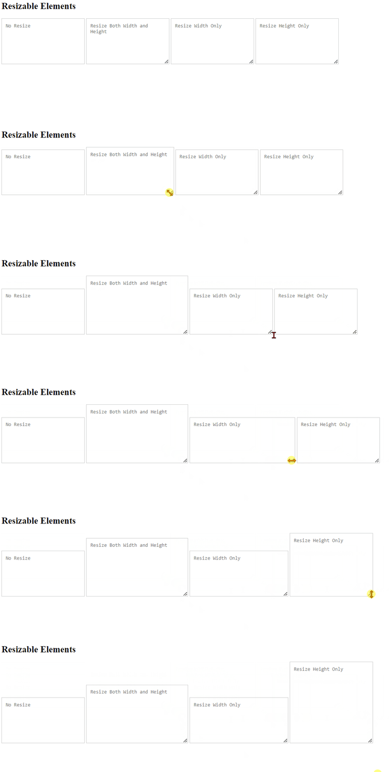
In this example:
- We have four
<textarea>elements with different classes:.no-resize,.both-resize,.horizontal-resize, and.vertical-resize. - In the CSS, we use the
resizeproperty to control the resizing behavior: .no-resizehasresize: none;, which disables resizing..both-resizehasresize: both;, allowing users to resize both width and height..horizontal-resizehasresize: horizontal;, allowing users to resize only the width..vertical-resizehasresize: vertical;, allowing users to resize only the height.- We also set some common styles like width, height, border, and padding for consistent presentation.
When you open this HTML file in a web browser, you can interact with the <textarea> elements to observe how the resize property affects their resizing behavior.
The “resize” property is handy when you want to provide users with the flexibility to adjust the size of textareas or other scrollable elements according to their preferences, improving the overall user experience on your website or application.
