CSS – Position
In CSS, “positioning” refers to the technique of precisely placing and arranging elements within a web page or layout. It plays a fundamental role in web design and allows web developers to control the placement of elements relative to their parent containers or other elements on the page.
There are several CSS properties related to positioning:
- position: This property defines the positioning method for an element. It can have values like “static,” “relative,” “absolute,” “fixed,” or “sticky.” Each value determines how an element interacts with its surrounding elements.
- top, right, bottom, left: These properties are often used in combination with the “position” property, especially with “absolute” and “fixed” positioning. They specify the distance between the element and its containing element or the viewport.
In CSS, position is a fundamental property that defines how elements are placed and interact within a web page’s layout. It plays a crucial role in web design, allowing developers to precisely position and control the behavior of elements. There are several values for the “position” property, each serving a specific purpose:
1. Static: This is the default position value. Elements with “position: static;” are placed in the normal document flow, following the order in the HTML markup. They are not affected by the “top,” “right,” “bottom,” or “left” properties.
In CSS, the position property is used to control the positioning of elements on a web page. When an element is given the position: static; property, it behaves according to the normal flow of the document, and its position is determined by its place in the HTML markup. Here’s an example in HTML and CSS that demonstrates the use of the position: static; property:
<!DOCTYPE html>
<html>
<head>
<style>
/* CSS styles for the static element */
.static-element {
position: static;
width: 200px;
height: 100px;
background-color: #336699;
color: white;
text-align: center;
line-height: 100px;
}
</style>
</head>
<body>
<h2>Static Position Example</h2>
<div class="static-element">
This is a static element.
</div>
<p>
This is a paragraph that follows the static element.
</p>
</body>
</html>Code language: HTML, XML (xml)Output :
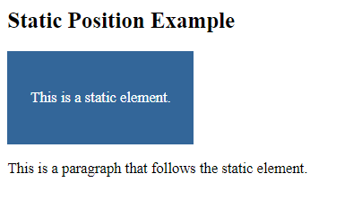
In this example:
- We have a
<div>element with the class.static-element. - In the CSS, we use the
.static-elementclass to setposition: static;, which is the default positioning behavior for elements. This means the element will follow the normal flow of the document. - We set some styling properties for the element, such as
width,height,background-color,text-align, andline-height. - There is also a paragraph (
<p>) element following the static element in the HTML markup.
When you open this HTML file in a web browser, you will see the static element displayed according to its place in the normal flow of the document. It appears above the paragraph element because it comes before it in the HTML markup. This demonstrates the default behavior of elements with position: static;, where their positioning is determined by their place in the document flow.
2. Relative: When you set “position: relative;”, an element is positioned relative to its normal position in the document flow. You can use the “top,” “right,” “bottom,” or “left” properties to offset it from its original position. Other elements in the document flow are not affected by it, and it leaves an empty space where it would have been.
In CSS, the position property with the value relative is used to position an element relative to its normal position in the document flow. This means you can use top, right, bottom, and left properties to shift the element from its default position. Here’s an example in HTML and CSS that demonstrates the use of position: relative;:
<!DOCTYPE html>
<html>
<head>
    <style>
        /* CSS styles for the relative element */
        .relative-element {
            position: relative;
            width: 200px;
            height: 100px;
            background-color: #336699;
            color: white;
            text-align: center;
            line-height: 100px;
        }

        /* CSS styles for the inner relative element */
        .inner-relative {
            position: relative;
            top: 20px;
            left: 30px;
            background-color: #ff6600;
        }
    </style>
</head>
<body>
    <h2>Relative Position Example</h2>
    <div class="relative-element">
        This is a relative element.
        <div class="inner-relative">
            Inner Relative
        </div>
    </div>
    <p>
        This is a paragraph outside the relative element.
    </p>
</body>
</html>Code language: HTML, XML (xml)
Output :
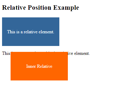
In this example:
- We have a
<div>element with the class.relative-element. Inside it, there’s another<div>element with the class.inner-relative. - In the CSS, we use the
.relative-elementclass to setposition: relative;for the outer element. - We use the
.inner-relativeclass to setposition: relative;for the inner element and then adjust itstopandleftproperties to shift it 20 pixels down and 30 pixels to the right relative to its normal position. - Both elements have their own background colors for better visibility.
When you open this HTML file in a web browser, you will see the outer relative element containing the inner relative element. The inner element has been shifted 20 pixels down and 30 pixels to the right from its normal position within the outer element. This demonstrates how position: relative; can be used to create relative positioning within elements.
3. Absolute: With “position: absolute;”, an element is removed from the document flow and positioned relative to its nearest positioned ancestor. If there is no positioned ancestor, it’s positioned relative to the initial containing block (usually the viewport). This allows precise control over an element’s placement on the page.
In CSS, the position property with the value absolute is used to position an element relative to its nearest positioned ancestor, or if none, relative to the initial containing block (typically the viewport). Here’s an example in HTML and CSS that demonstrates the use of position: absolute;:
<!DOCTYPE html>
<html>
<head>
    <style>
        /* CSS styles for the relative container */
        .relative-container {
            position: relative;
            width: 300px;
            height: 200px;
            background-color: #f1f1f1;
        }

        /* CSS styles for the absolute element */
        .absolute-element {
            position: absolute;
            width: 100px;
            height: 50px;
            background-color: #336699;
            color: white;
            text-align: center;
            line-height: 50px;
            top: 20px;
            left: 50px;
        }
    </style>
</head>
<body>
    <h2>Absolute Position Example</h2>
    <div class="relative-container">
        <div class="absolute-element">
            Absolute Element
        </div>
    </div>
    <p>
        This is a paragraph outside the absolute element.
    </p>
</body>
</html>Code language: HTML, XML (xml)
Output :
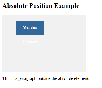
In this example:
- We have a
<div>element with the class.relative-container, which serves as the relative container. - Inside the relative container, there’s another
<div>element with the class.absolute-element. - In the CSS, we use the
.relative-containerclass to setposition: relative;for the relative container. - We use the
.absolute-elementclass to setposition: absolute;for the inner absolute element. We also adjust itstopandleftproperties to position it 20 pixels down and 50 pixels to the right relative to its nearest positioned ancestor, which is the relative container. - Both elements have their own background colors for better visibility.
When you open this HTML file in a web browser, you will see the absolute element positioned within the relative container as specified by the top and left properties. This demonstrates how position: absolute; can be used to position elements relative to their nearest positioned ancestor.
4. Fixed: position: fixed; is similar to “absolute,” but the element is fixed to the viewport. It remains in the same position, even when the page is scrolled. It’s often used for fixed navigation bars or elements like modals.
In CSS, the position property with the value fixed is used to position an element relative to the viewport (the browser window). A fixed element remains in the same position even when the page is scrolled. Here’s an example in HTML and CSS that demonstrates the use of position: fixed;:
<!DOCTYPE html>
<html>
<head>
    <style>
        /* CSS styles for the fixed element */
        .fixed-element {
            position: fixed;
            width: 200px;
            height: 100px;
            background-color: #336699;
            color: white;
            text-align: center;
            line-height: 100px;
            top: 20px;
            left: 20px;
        }

        /* CSS styles for the content */
        .content {
            margin-top: 150px; /* Add margin to create space below the fixed element */
            padding: 20px;
        }
    </style>
</head>
<body>
    <h2>Fixed Position Example</h2>
    <div class="fixed-element">
        Fixed Element
    </div>
    <div class="content">
        <p>
            This is the content of the page.
        </p>
        <p>
            Scroll down to see how the fixed element stays in place.
        </p>
    </div>
</body>
</html>Code language: HTML, XML (xml)
Output :
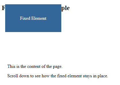
In this example:
- We have a
<div>element with the class.fixed-element. This element is positioned usingposition: fixed;, and itstopandleftproperties are set to20pxeach to position it 20 pixels from the top and left of the viewport. - There’s also a content
<div>with the class.content, which contains some paragraphs. - In the CSS, we use the
.fixed-elementclass to apply styles to the fixed element, such as its dimensions, background color, and text styling. - We add
margin-topto the.contentclass to create space below the fixed element so that the content is not obscured by the fixed element.
When you open this HTML file in a web browser and scroll down, you will see that the fixed element remains in the same position, even as you scroll. This demonstrates how position: fixed; can be used to create elements that stay fixed relative to the viewport.
5. Sticky: position: sticky;” is a unique value. It acts as a combination of “relative” and “fixed.” An element behaves like “relative” until it reaches a specified scroll position, after which it becomes “fixed” and remains in that position as the user scrolls.
In CSS, the position property with the value sticky is used to create an element that behaves as relative until it reaches a certain scroll position, after which it becomes fixed. This allows the element to “stick” to a specific position in the viewport as the user scrolls. Here’s an example in HTML and CSS that demonstrates the use of position: sticky;:
<!DOCTYPE html>
<html>
<head>
    <style>
        /* CSS styles for the container */
        .container {
            height: 400px;
            overflow: auto; /* Enable scrolling within the container */
        }

        /* CSS styles for the sticky element */
        .sticky-element {
            position: -webkit-sticky; /* For Safari */
            position: sticky;
            top: 20px; /* Stick to the top of the container when scrolling */
            width: 200px;
            height: 100px;
            background-color: #336699;
            color: white;
            text-align: center;
            line-height: 100px;
        }
    </style>
</head>
<body>
    <h2>Sticky Position Example</h2>
    <div class="container">
        <p>
            Scroll down to see the sticky element stick to the top.
        </p>
        <div class="sticky-element">
            Sticky Element
        </div>
        <p>
            This is the rest of the content within the container.
        </p>
    </div>
</body>
</html>Code language: HTML, XML (xml)
Output :
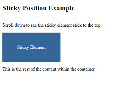
In this example:
- We have a container
<div>with the class.containerthat has a fixed height and scrollable content. This container is used to demonstrate the behavior of the sticky element within a scrollable context. - Inside the container, there’s another
<div>element with the class.sticky-element, which is the element we want to make sticky. We setposition: sticky;andtop: 20px;to make it stick to the top of the container when scrolling. - We also include
-webkit-sticky;with a vendor prefix (-webkit-) for Safari compatibility. - The sticky element has dimensions, a background color, and text styling applied to it.
When you open this HTML file in a web browser and scroll down within the container, you will see that the sticky element initially behaves as a relative element but becomes fixed and sticks to the top of the container when it reaches a specified position (20 pixels from the top). This demonstrates how position: sticky; can be used to create sticky elements that stick to a specific position as you scroll through content.
The “position” property is a fundamental building block for creating responsive and dynamic web layouts. By using it in combination with other CSS properties like “top,” “right,” “bottom,” “left,” and “z-index,” web designers can achieve precise control over the placement and behavior of elements, leading to visually appealing and functional websites.
Related posts:

Powered by YARPP.