CSS – Height & Width (Dimension)
In CSS, “height” and “width” are fundamental properties that allow you to control the size of HTML elements on a webpage.
1. Height:
- Height refers to the vertical measurement of an element, indicating how tall it should be. You can set the height of elements using the
heightCSS property. - For instance, if you want to make an image 200 pixels tall, you would use
height: 200px;in your CSS.
2. Width:
- Width pertains to the horizontal measurement of an element, determining how wide it should be. You can set the width of elements using the
widthCSS property. - For example, if you want to create a container that is 300 pixels wide, you would use
width: 300px;in your CSS.
3. Max-Height:
- Max-height is a CSS property that defines the maximum allowable height for an HTML element.
- It ensures that the element won’t exceed the specified height, even if its content or other CSS properties would naturally make it taller.
- For example, if you have an image and you set a
max-height: 200px;, it will never be displayed taller than 200 pixels, regardless of its original size or the size of the container.
4. Max-Width:
- Max-width is similar to max-height, but it deals with the maximum allowable width of an HTML element.
- It ensures that the element won’t become wider than the specified width, no matter how much content or padding it contains.
- For instance, if you set a
max-width: 300px;for a text block, it will never extend beyond 300 pixels in width.
5. Min-Height:
- Min-height is another CSS property that sets the minimum height that an element must have.
- If the content within the element is less than this minimum height, the element will automatically expand to meet or exceed the specified minimum height.
- For example, you can use
min-height: 100px;for a div to ensure it is at least 100 pixels tall, even if it contains very little content.
6. Min-Width:
- Min-width is the counterpart to min-height but deals with the minimum allowable width of an HTML element.
- It guarantees that the element will be at least as wide as the specified minimum, even if its content or other CSS properties would make it narrower.
- If you have a button and set
min-width: 150px;, it will always be at least 150 pixels wide, accommodating longer text if necessary.
These properties are crucial for responsive web design, ensuring that elements adapt gracefully to different screen sizes and content variations. They provide control over the size limits and flexibility of elements, making your web layout more versatile and user-friendly.
Example :
<!DOCTYPE html>
<html>
<head>
<style>
/* CSS styles to set height, width, max-height, max-width, min-height, and min-width */
.dimension-element {
background-color: #336699;
padding: 10px;
}
/* Apply height and width */
.fixed-dimension {
height: 200px;
width: 300px;
margin: 10px;
}
/* Apply max-height and max-width */
.max-dimension {
max-height: 150px;
max-width: 250px;
margin: 10px;
}
/* Apply min-height and min-width */
.min-dimension {
min-height: 100px;
min-width: 150px;
}
</style>
</head>
<body>
<h2>Dimension Properties</h2>
<div class="dimension-element fixed-dimension">
Fixed Height and Width (200px x 300px)
</div>
<div class="dimension-element max-dimension">
Maximum Height and Width (150px x 250px)
</div>
<div class="dimension-element min-dimension">
Minimum Height and Width (100px x 150px)
</div>
</body>
</html>
Code language: HTML, XML (xml)Output :
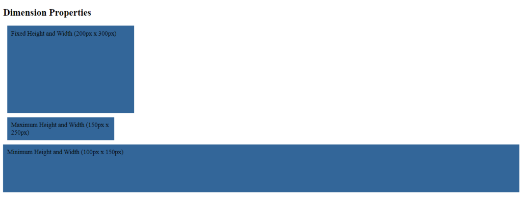
In this example:
- We have three
<div>elements with different classes:.fixed-dimension,.max-dimension, and.min-dimension. - CSS styles are applied to these elements to set their background color and padding.
- For the
.fixed-dimensionclass, we use theheightandwidthproperties to set a fixed dimension of200pxfor the height and300pxfor the width. - For the
.max-dimensionclass, we use themax-heightandmax-widthproperties to set maximum dimensions of150pxfor the height and250pxfor the width. This means the element can’t exceed these dimensions, but it can be smaller. - For the
.min-dimensionclass, we use themin-heightandmin-widthproperties to set minimum dimensions of100pxfor the height and150pxfor the width. This means the element must be at least this size but can be larger.
When you open this HTML file in a web browser, you will see three <div> elements with different dimension properties applied to them. You can observe how each property affects the size of the elements.
By using height and width properties, you can ensure that your web design looks consistent, well-structured, and visually appealing across various devices and screen sizes.
