---
title: "CSS – Margin"
url: https://khanwaseem.com/blog/course/css-margin
author: "khan Waseem"
published: 2023-09-15
updated: 2023-09-15
topics: ["course", "CSS Tutorial"]
description: "Explore CSS margins: Learn how to control spacing, layout, and whitespace on web pages with margin properties in your web design."
---

# CSS – Margin

Certainly! In web design and CSS (Cascading Style Sheets), margins play a crucial role in controlling the spacing and layout of elements on a web page. Margins are the space between an element’s border and adjacent elements. Here’s how you can use margins in CSS:

**1. Margin Properties:**

In CSS, you can control the margin properties of HTML elements to specify the space around an element. The margin properties include `margin-top`, `margin-right`, `margin-bottom`, and `margin-left`. Here’s an example that demonstrates the use of these margin properties:

```xml
<!DOCTYPE html>
<html>
<head>
    <style>
        /* CSS styles for the div element */
        .margin-div {
            width: 200px;
            height: 100px;
            background-color: #336699;
            margin-top: 20px;
            /* Add 20px of margin on the top */
            margin-right: 30px;
            /* Add 30px of margin on the right */
            margin-bottom: 40px;
            /* Add 40px of margin on the bottom */
            margin-left: 50px;
            /* Add 50px of margin on the left */
        }
    </style>
</head>
<body>
    <div style="border: 1px solid;width: 300px;">
        <div class="margin-div">This div has margins specified on all sides.</div>
    </div>
</body>
</html>Code language: HTML, XML (xml)
```

**Output : **
![](https://blogkhanwaseem.s3.amazonaws.com/uploads/2023/09/15102314/image-88.png)

**In this example:**

- We create a CSS class called `.margin-div`.

- We set the `width` and `height` of the `<div>` element and give it a background color for visibility.

- We use the `margin-top`, `margin-right`, `margin-bottom`, and `margin-left` properties to specify different margin values for each side of the `<div>`.

- The specified margin values are in pixels, but you can use other valid CSS units like `em`, `rem`, or percentages.

As a result, the `<div>` element has margins of 20px on the top, 30px on the right, 40px on the bottom, and 50px on the left, creating space around the element. You can adjust these margin values to achieve the desired spacing for your HTML elements.

**2. Shorthand Margin Property (`margin`):**

The `margin` property in CSS is a shorthand property that allows you to set all four margin properties (top, right, bottom, and left) in one declaration. Here’s an example of how to use the `margin` property in HTML:

```xml
<!DOCTYPE html>
<html>

<head>
    <style>
        /* CSS styles for the div element */
        .margin-div {
            width: 200px;
            height: 100px;
            background-color: #336699;
            margin: 20px 30px 40px 50px;
            /* Shorthand margin declaration */
        }
    </style>
</head>

<body>
    <div style="border: 1px solid;width: 300px;">
        <div class="margin-div">This div has margins specified using the shorthand 'margin' property.</div>
    </div>
</body>

</html>Code language: HTML, XML (xml)
```

**Output : **
![](https://blogkhanwaseem.s3.amazonaws.com/uploads/2023/09/15101945/image-87.png)

**In this example:**

- We create a CSS class called `.margin-div`.

- We use the `margin` property to specify margins for all four sides in the order of top, right, bottom, and left.

- The values `20px 30px 40px 50px` represent 20 pixels of margin on the top, 30 pixels on the right, 40 pixels on the bottom, and 50 pixels on the left.

This results in the `<div>` element having margins specified using the shorthand `margin` property, creating space around the element. You can adjust these margin values to control the spacing as needed for your HTML elements.

**3. Auto Margin:**

You can use the `auto` value for margins in CSS to horizontally center block-level elements within their containing parent element. Here’s an example of how to use `auto` margins in HTML to center a `<div>` horizontally:

```xml
<!DOCTYPE html>
<html>
<head>
    <style>
        /* CSS styles for the container */
        .container {
            width: 300px; /* Set the container to the full width of its parent */
            height: 200px;
            background-color: skyblue;
            display: flex; /* Use flexbox to center the child element */
            justify-content: center; /* Center content horizontally */
            align-items: center; /* Center content vertically */
        }

        /* CSS styles for the centered element */
        .centered-div {
            width: 200px;
            height: 100px;
            background-color: #336699;
        }
    </style>
</head>
<body>
    <div class="container">
        <div class="centered-div">Centered Div</div>
    </div>
</body>
</html>Code language: HTML, XML (xml)
```

**Output : **
![](https://blogkhanwaseem.s3.amazonaws.com/uploads/2023/09/15102628/image-89.png)

**In this example:**

- We create a container `<div>` with the class `.container` and set it to 100% width and a fixed height. This container serves as a wrapper for the centered content.

- Inside the container, we have another `<div>` with the class `.centered-div` that we want to center horizontally.

- We use flexbox by setting `display: flex;` on the `.container` to horizontally and vertically center its child elements.

- `justify-content: center;` centers the child element horizontally, and `align-items: center;` centers it vertically.

As a result, the `.centered-div` is horizontally centered within its container. You can adjust the container’s width, height, and the size of the centered element according to your design needs.

**4. Negative Margins:**

Negative margins in HTML and CSS can be used to create various layout effects, such as overlapping elements or pulling elements outside their containing element. Here’s an example of using negative margins to overlap two elements:

```xml
<!DOCTYPE html>
<html>
<head>
    <style>
        /* CSS styles for the container */
        .container {
            width: 300px;
            height: 150px;
            background-color: #f2f2f2;
            padding: 20px;
        }

        /* CSS styles for the overlapping element */
        .overlap-div {
            width: 200px;
            height: 100px;
            background-color: #336699;
            margin-left: -20px; /* Apply a negative margin to overlap the container */
            margin-top: -20px; /* Apply a negative margin to overlap the container */
        }
    </style>
</head>
<body>
    <div class="container">
        <div class="overlap-div">Overlapping Div</div>
    </div>
</body>
</html>Code language: HTML, XML (xml)
```

**Output : **

![](https://blogkhanwaseem.s3.amazonaws.com/uploads/2023/09/15103210/image-90.png)

**In this example:**

- We create a container `<div>` with the class `.container`, and we set its width, height, and padding to create a visible space.

- Inside the container, we have another `<div>` with the class `.overlap-div`. We use negative margins (`-20px`) for both `margin-left` and `margin-top` to overlap this element with the container.

- The negative margins pull the `.overlap-div` outside the boundaries of the container.

This results in the `.overlap-div` partially covering the container. Negative margins can be used creatively to achieve various layout effects, but they should be used carefully to ensure that your layout remains accessible and responsive.

- Margin collapsing occurs when adjacent margins of block-level elements touch or overlap. The larger margin value is applied.

- Example: If two adjacent paragraphs have margins of 20px and 30px, the space between them will be 30px, not 50px.

**6. Margin Units:**

In CSS, you can specify margin values using different units such as pixels (px), ems (em), rems (rem), percentages (%), and more. Here’s an example of using different units for margin in HTML:

```xml
<!DOCTYPE html>
<html>

<head>
    <style>
        .container{
            display: flex;
        }
        /* CSS styles for the div element */
        .margin-div {
            width: 100px;
            height: 50px;
            background-color: #336699;
        }

        /* Different margin values using various units */
        .margin-px {
            margin: 20px;
            /* 20 pixels of margin on all sides */
        }

        .margin-em {
            margin: 2em;
            /* 2 ems of margin on all sides */
        }

        .margin-rem {
            margin: 2rem;
            /* 2 rems of margin on all sides */
        }

        .margin-percent {
            margin: 10%;
            /* 10% margin on all sides based on the parent container's width */
        }
    </style>
</head>

<body>
    <div class="container">
        <div class="margin-div margin-px">20px margin</div>
        <div class="margin-div margin-em">2em margin</div>
        <div class="margin-div margin-rem">2rem margin</div>
        <div class="margin-div margin-percent">10% margin</div>
    </div>
</body>

</html>Code language: HTML, XML (xml)
```

**Output : **

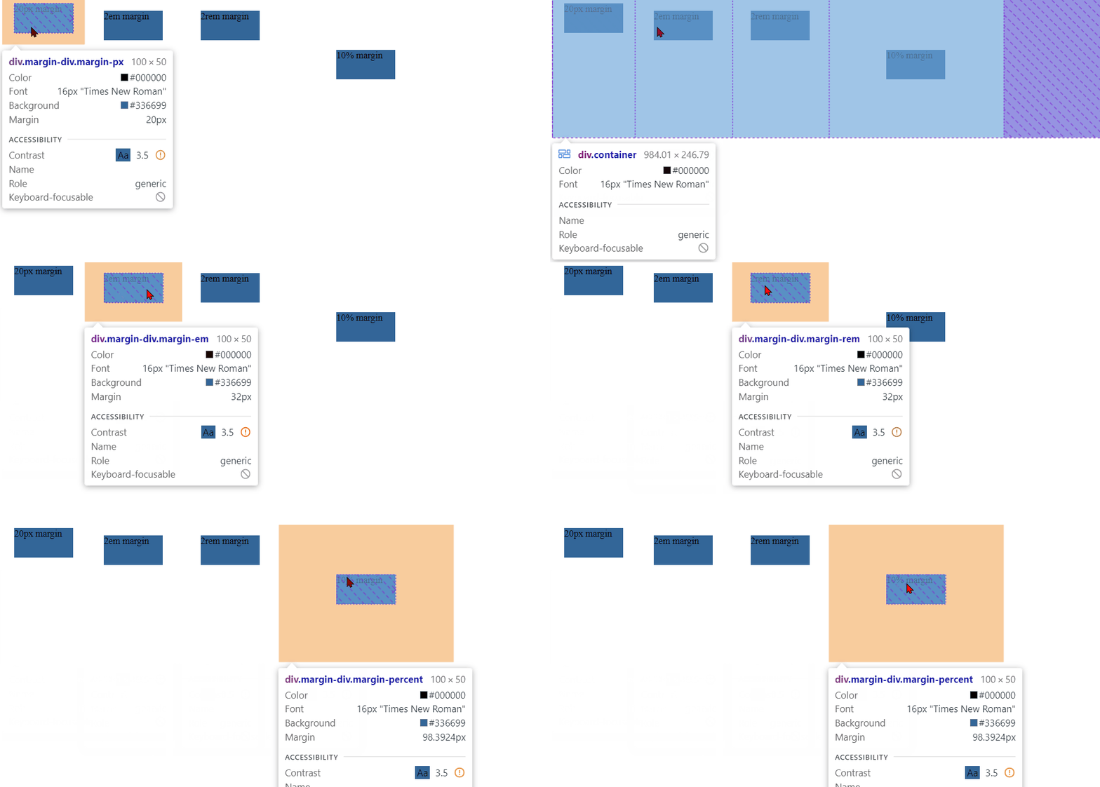
![](https://blogkhanwaseem.s3.amazonaws.com/uploads/2023/09/15162701/Margin1.gif)

**In this example:**

- We create a CSS class called `**.margin-div**` that defines the styles for a `<div>` element with a fixed width, height, and background color.

- We then create four additional classes, each applying different margin values to the `**.margin-div**` element:

- `**.margin-px**` applies a margin of `20px` on all sides.

- `**.margin-em**` applies a margin of `2em` on all sides.

- `**.margin-rem**` applies a margin of `2rem` on all sides.

- `**.margin-percent**` applies a margin of `10%` on all sides based on the parent container’s width.

You can see how different units affect the margin size. Adjust the values and units as needed to achieve the desired spacing and layout for your HTML elements.

**7. Margin Reset:**

A margin reset is a CSS technique used to remove the default margin that browsers apply to certain HTML elements, such as headings and paragraphs. This is often done to create consistent spacing between elements in a design. You can reset margins using CSS by setting them to zero. Here’s an example of a margin reset in HTML:

```xml
<!DOCTYPE html>
<html>
<head>
    <style>
        /* CSS styles to reset margins for headings and paragraphs */
        h1, h2, h3, h4, h5, h6, p {
            margin: 0;
        }
    </style>
</head>
<body>
    <h1>Heading 1</h1>
    <p>This is a paragraph.</p>
    <h2>Heading 2</h2>
    <p>Another paragraph.</p>
</body>
</html>Code language: HTML, XML (xml)
```

**Output : **

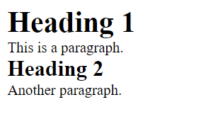
![](https://blogkhanwaseem.s3.amazonaws.com/uploads/2023/09/15113005/image-91.png)

**In this example:**

- We create a CSS rule that selects heading elements (`h1` through `h6`) and paragraphs (`p`).

- We set the `margin` property for these elements to `0`, effectively resetting their margins to zero.

As a result, the default margins that browsers apply to headings and paragraphs are removed, and there will be no space around these elements. You can apply this margin reset selectively to specific elements as needed to achieve your desired layout and spacing.

**8. Margin Collapse Prevention:**

Margin collapse is a phenomenon in CSS where the margins of adjacent elements can combine or collapse into a single margin under certain conditions. To prevent margin collapse, you can use various techniques. Here’s an example of how to prevent margin collapse using CSS:

```xml
<!DOCTYPE html>
<html>
<head>
    <style>
        /* CSS styles to prevent margin collapse */
        .container::after {
            content: "";
            display: table;
            clear: both;
        }

        .box {
            float: left;
            width: 50%;
            margin: 20px; /* Add margins to create space between boxes */
        }
    </style>
</head>
<body>
    <div class="container">
        <div class="box">
            <p>This is Box 1</p>
            <p>Some content in Box 1.</p>
        </div>
        <div class="box">
            <p>This is Box 2</p>
            <p>Some content in Box 2.</p>
        </div>
    </div>
</body>
</html>Code language: HTML, XML (xml)
```

**Output : **

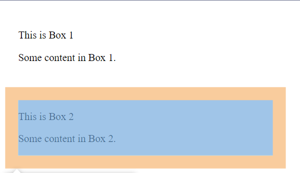
![](https://blogkhanwaseem.s3.amazonaws.com/uploads/2023/09/15113505/image-92.png)

**In this example:**

- We create a container `<div>` with the class `.container`. Inside this container, we have two child `<div>` elements with the class `.box`. These child elements are floated left.

- To prevent margin collapse between the `.box` elements, we use a clearfix technique. We create a pseudo-element `::after` for the container and apply the CSS properties `content: "";`, `display: table;`, and `clear: both;`. This clearfix prevents margin collapse between the floated elements inside the container.

- Each `.box` element has a margin of `20px` to create space between them.

By using the clearfix technique, you can prevent margin collapse between elements that are floated or otherwise positioned in a way that might cause margin collapse to occur.

Margins are essential for creating whitespace and defining the layout of elements in web design. Properly adjusting margins can enhance the overall aesthetics and readability of your web pages.

### Related posts:

[JavaScript – Events](https://blog.khanwaseem.com/javascript-events/)
[CSS – Padding](https://blog.khanwaseem.com/css-padding/)
[CSS – @ Rules](https://blog.khanwaseem.com/css-rules/)
[CSS – Pseudo Classes](https://blog.khanwaseem.com/css-pseudo-classes/)

Powered by [YARPP](https://yarpp.com).
