---
title: "CSS – Links"
url: https://khanwaseem.com/blog/course/css-links
author: "khan Waseem"
published: 2023-09-14
updated: 2023-09-14
topics: ["course", "CSS Tutorial"]
description: "Enhance user experience with CSS link styling. Learn how to customize link colors, hover effects, and more to create visually engaging web designs."
---

# CSS – Links

Certainly! In CSS, styling links is essential to create a coherent and user-friendly web design. Links are the primary means of navigation on a website, and CSS allows you to customize their appearance to provide visual cues to users. Here’s how you can style links using CSS:

**1. Link Color (`color`):**

You can define the color of links using the `color` property. This sets the default color for unvisited links.

To specify the color of links in HTML using CSS, you can use the `color` property. Here’s an example:

```xml
<!DOCTYPE html>
<html>
<head>
    <style>
        /* CSS styles to control link color */
        .custom-link {
            color: #336699; /* Set link color to a custom hexadecimal color */
        }
    </style>
</head>
<body>
    <a class="custom-link" href="https://www.example.com">Visit Example.com</a>
</body>
</html>Code language: HTML, XML (xml)
```

**Output : **

![](https://blogkhanwaseem.s3.amazonaws.com/uploads/2023/09/14161927/image-61.png)

**In this example:**

- We define a CSS class called `.custom-link`.

- We set the `color` property to `#336699`, which specifies a custom hexadecimal color code.

You can apply this class to any link (`<a>` element) to change the link’s text color. You can specify the desired color using a color name, hexadecimal code, RGB value, or any other valid CSS color representation.

**2. Visited Link Color (`:visited` pseudo-class):**

The `:visited` pseudo-class allows you to style links that have been visited. This helps users differentiate between visited and unvisited links.

To specify the color of visited links in HTML using CSS, you can use the `:visited` pseudo-class. Here’s an example:

```xml
<!DOCTYPE html>
<html>
<head>
    <style>
        /* CSS styles to control visited link color */
        a:visited {
            color: purple; /* Set color for visited links to purple */
        }
    </style>
</head>
<body>
    <p><a href="https://www.example.com">Visit Example.com</a></p>
</body>
</html>Code language: HTML, XML (xml)
```

**Output : **

![](https://blogkhanwaseem.s3.amazonaws.com/uploads/2023/09/14162123/image-62.png)

**In this example:**

- We use the `a:visited` selector to target visited links (`<a>` elements that the user has previously visited).

- We set the `color` property to `purple`, which specifies the color for visited links.

When a user clicks on the link and visits the URL, the link text will change to the specified purple color, indicating that it is a visited link. You can adjust the color to your preference by changing the value of the `color` property.

**3. Hover Effect (`:hover` pseudo-class):**

The `:hover` pseudo-class lets you define the style of links when a user hovers their mouse pointer over them. This can include changing the color, adding underlines, or applying other visual effects.

You can create a hover effect for HTML elements using the `:hover` pseudo-class in CSS. This effect allows you to change the appearance of an element when a user hovers their mouse pointer over it. Here’s an example using a button:

```xml
<!DOCTYPE html>
<html>
<head>
    <style>
        /* CSS styles to create a hover effect */
        .hover-button {
            background-color: #336699;
            color: white;
            padding: 10px 20px;
            border: none;
            cursor: pointer;
        }

        /* Add a hover effect when the mouse is over the button */
        .hover-button:hover {
            background-color: #004466;
        }
    </style>
</head>
<body>
    <button class="hover-button">Hover Over Me</button>
</body>
</html>Code language: HTML, XML (xml)
```

**Output : **

![](https://blogkhanwaseem.s3.amazonaws.com/uploads/2023/09/14162422/image-63.png)

**In this example:**

- We define a CSS class called `.hover-button` to style the button.

- Initially, the button has a blue background (`#336699`), white text, and padding for better readability.

- The `cursor: pointer;` property is added to indicate that the element is clickable.

Then, we create a hover effect using the `.hover-button:hover` selector:

- When a user hovers their mouse pointer over the button, the background color changes to a darker blue (`#004466`) to provide visual feedback.

This demonstrates a simple hover effect, but you can apply similar techniques to other HTML elements like links, images, or any element you want to style differently when hovered over.

**4. Active Link Style (`:active` pseudo-class):**

The `:active` pseudo-class styles links when they are clicked. You can use it to provide immediate feedback to users when they interact with a link.

You can use the `:active` pseudo-class in CSS to define the styles for a link when it’s in an active state, such as when the user clicks on it. Here’s an example:

```xml
<!DOCTYPE html>
<html>
<head>
    <style>
        /* CSS styles for a link in the active state */
        a:active {
            color: red; /* Change link text color to red when clicked */
            text-decoration: underline; /* Add an underline when clicked */
        }
    </style>
</head>
<body>
    <p>Click the <a href="#">link</a> to see the active style.</p>
</body>
</html>Code language: HTML, XML (xml)
```

**Output : **

![](https://blogkhanwaseem.s3.amazonaws.com/uploads/2023/09/14162828/image-64.png)

**In this example:**

- We use the `a:active` selector to target the link (`<a>`) when it’s in the active state (e.g., when clicked).

- We change the link’s text color to red and add an underline to the text to indicate the active state.

When you click the link, you’ll see that the link’s text turns red and is underlined while it’s in the active state. You can customize the styles inside the `a:active` rule to achieve the desired appearance for active links.

**5. Link Underline Removal (`text-decoration`):**

To remove the default underlines from links, you can use the `text-decoration` property.

You can remove the underline from links in HTML using the `text-decoration` property in CSS. Here’s an example:

```xml
<!DOCTYPE html>
<html>
<head>
    <style>
        /* CSS styles to remove underline from links */
        .no-underline-link {
            text-decoration: none; /* Remove underline from links */
            color: #336699; /* Set link color */
        }
    </style>
</head>
<body>
    <p><a class="no-underline-link" href="https://www.example.com">Visit Example.com</a></p>
</body>
</html>Code language: HTML, XML (xml)
```

**Output : **
![](https://blogkhanwaseem.s3.amazonaws.com/uploads/2023/09/14163249/image-65.png)

**In this example:**

- We define a CSS class called `.no-underline-link`.

- We set the `text-decoration` property to `none`, which removes the underline from links.

- We also specify a custom link color using the `color` property.

As a result, the link within the paragraph will not have an underline, and you can customize the link color using the `color` property. This is useful when you want to style links without underlines for aesthetic or design reasons.

**6. Link Transition Effects (`transition`):**

You can add smooth transitions to link styles using the `transition` property. This provides a subtle animation when users interact with links.

You can create transition effects for links in HTML using the `transition` property in CSS. Transition effects make links change smoothly when interacting with them, such as when hovering over or clicking on them. Here’s an example using a link:

```xml
<!DOCTYPE html>
<html>
<head>
    <style>
        /* CSS styles for link transitions */
        .transition-link {
            color: #336699; /* Set default link color */
            text-decoration: underline; /* Add an underline to links */
            transition: color 0.3s ease, text-decoration 0.3s ease; /* Define transition properties */
        }

        /* Add hover effect for links */
        .transition-link:hover {
            color: #ff6633; /* Change link color when hovered */
            text-decoration: none; /* Remove underline when hovered */
        }
    </style>
</head>
<body>
    <p>Hover over this <a class="transition-link" href="https://www.example.com">link</a> to see the transition effect.</p>
</body>
</html>Code language: HTML, XML (xml)
```

**Output : **

![](https://blogkhanwaseem.s3.amazonaws.com/uploads/2023/09/14163456/image-66.png)

**In this example:**

- We define a CSS class called `.transition-link` to style the link.

- Initially, the link has a blue color (`#336699`) and an underline.

- We use the `transition` property to define transition effects for `color` and `text-decoration`. These transitions take 0.3 seconds and use the `ease` timing function to create a smooth color and underline change.

Then, we create a hover effect using the `.transition-link:hover` selector:

- When a user hovers their mouse pointer over the link, the link’s color changes to orange (`#ff6633`) and the underline is removed, creating a smooth transition effect.

You can customize the transition properties to achieve different timing and effects for your links.

**7. Styling Specific Links (`class` or `id` attributes):**

You can target specific links for unique styling by assigning them classes or IDs in your HTML and then styling them in CSS.

You can style specific links in HTML using either the `class` or `id` attributes to apply custom CSS styles. Here’s an example of both approaches:

**Using the `class` attribute:**

```xml
<!DOCTYPE html>
<html>
<head>
    <style>
        /* CSS styles for links with a specific class */
        .custom-link {
            color: #336699; /* Set link color */
            text-decoration: underline; /* Add an underline to links */
        }
    </style>
</head>
<body>
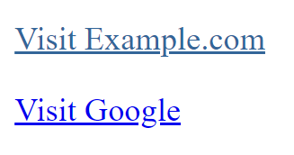
    <p><a class="custom-link" href="https://www.example.com">Visit Example.com</a></p>
    <p><a href="https://www.google.com">Visit Google</a></p>
</body>
</html>Code language: HTML, XML (xml)
```

**Output : **

![](https://blogkhanwaseem.s3.amazonaws.com/uploads/2023/09/14163848/image-67.png)

In this example, we apply a specific style to links with the class `custom-link`. The second link does not have this class and, therefore, does not have the custom style.

**Using the `id` attribute:**

```xml
<!DOCTYPE html>
<html>
<head>
    <style>
        /* CSS styles for a link with a specific ID */
        #unique-link {
            color: #336699; /* Set link color */
            text-decoration: underline; /* Add an underline to the link */
        }
    </style>
</head>
<body>
    <p><a id="unique-link" href="https://www.example.com">Visit Example.com</a></p>
    <p><a href="https://www.google.com">Visit Google</a></p>
</body>
</html>Code language: HTML, XML (xml)
```

**Output : **

![](https://blogkhanwaseem.s3.amazonaws.com/uploads/2023/09/14163917/image-68.png)

In this example, we apply a specific style to the link with the ID `unique-link`. The first link has this ID and receives the custom style, while the second link does not have the ID and does not receive the custom style.

You can use either the `class` or `id` attribute to target and style specific links, depending on your needs. `class` is typically used when you want to apply the same style to multiple elements, while `id` is used for unique identification and styling of a single element.

Styling links in CSS allows you to create a consistent and visually appealing user experience. It’s important to strike a balance between customization and maintaining usability so that users can easily identify and navigate through your website’s content.

### Related posts:

[CSS – Pseudo Classes](https://blog.khanwaseem.com/css-pseudo-classes/)
[CSS – Text](https://blog.khanwaseem.com/css-text/)
[CSS – @ Rules](https://blog.khanwaseem.com/css-rules/)
[CSS – Table](https://blog.khanwaseem.com/css-table/)

Powered by [YARPP](https://yarpp.com).
