---
title: "CSS – Float"
url: https://khanwaseem.com/blog/course/css-float
author: "khan Waseem"
published: 2023-09-16
updated: 2023-09-16
topics: ["course", "CSS Tutorial"]
description: "Understand CSS float types: left, right, inherit, initial, and none, for precise control over element positioning and layout in web design."
---

# CSS – Float

In CSS, “float” is a property that allows elements to be pushed to one side of their containing element, typically left or right. It’s often used for creating multi-column layouts and text wrapping around images or other elements.

Think of it like this: Imagine you have a container, and you want to place multiple elements side by side horizontally. You can use the `float` property to make these elements “float” to the left or right within the container, aligning them as specified.

** float** property has several values that control how elements should float within their containing elements. Here are explanations of each of these values in human terms:

- **Float Left:** When you set an element’s float property to “left,” you’re telling it to move as far to the left as possible within its containing element. This often results in other content flowing around it on the right side.

- **Float Right:** Conversely, when you use “float: right,” the element will float to the right within its container, and content will wrap around it on the left side.

- **Float Inherit:** If you set an element to “float: inherit,” it will inherit the float property from its parent element. This means it will behave as its parent does in terms of floating.

- **Float Initial:** “Float: initial” resets the element’s float property to its default value. This is often equivalent to “float: none.”

- **Float None:** When you specify “float: none,” the element will not float at all. It will remain in the normal flow of the document, and other content won’t wrap around it.

In CSS, the `float` property is used to specify how an element should be floated to the left or right of its containing element. Additionally, you can use values like `inherit`, `initial`, and `none` to control the floating behavior. Here’s an example in HTML that demonstrates these `float` values:

```xml
<!DOCTYPE html>
<html>
<head>
    <style>
        /* CSS styles to set the float property */
        .left-float {
            float: left;
            width: 150px;
            height: 100px;
            background-color: #336699;
            margin-right: 20px;
        }

        .right-float {
            float: right;
            width: 150px;
            height: 100px;
            background-color: #ff6600;
            margin-left: 20px;
        }

        .no-float {
            float: none; /* No floating */
            clear: both; /* Clear any previous floats */
        }
    </style>
</head>
<body>
    <h2>Float Property Examples</h2>
    <div class="left-float">Left Float</div>
    <div class="right-float">Right Float</div>
    <div class="no-float">
        <p>This div has no float.</p>
        <p>It's not affected by the floats above.</p>
    </div>
</body>
</html>Code language: HTML, XML (xml)
```

**Output : **

![](https://blogkhanwaseem.s3.amazonaws.com/uploads/2023/09/16111451/image-114-1024x193.png)

**In this example:**

- We have three `<div>` elements with different classes: `.left-float`, `.right-float`, and `.no-float`.

- For the `.left-float` and `.right-float` classes, we use the `float` property to make these elements float to the left and right, respectively.

- We also set `width`, `height`, background color, and margins to style these floated elements.

- For the `.no-float` class, we use the `float: none` property to prevent floating. We also use `clear: both` to clear any previous floats, ensuring that the content below this element is not affected by the floating elements above it.

When you open this HTML file in a web browser, you will see the three `<div>` elements with different floating behaviors: left, right, and no float. This demonstrates how the `float` property controls the positioning of elements within their containing elements.

Table of Contents

[Toggle](#)

- [CSS Float – Three Column Layout](#css-float-%e2%80%93-three-column-layout)
- [CSS Float Example – Images Next To Each Other](#css-float-example-%e2%80%93-images-next-to-each-other)

## CSS Float – Three Column Layout

Creating a three-column layout using CSS floats is a common web design pattern. Here’s an example in HTML and CSS for a simple three-column layout:

```xml
<!DOCTYPE html>
<html>
<head>
    <style>
        /* CSS styles for the container */
        .container {
            width: 100%;
            margin: 0 auto;
            background-color: #f1f1f1;
            overflow: hidden; /* Clear floats */
        }

        /* CSS styles for the columns */
        .column {
            width: 30%; /* Adjust the width as needed */
            float: left;
            padding: 20px;
            background-color: #336699;
            color: white;
            margin: 10px;
            box-sizing: border-box; /* Include padding and border in the width */
        }

        /* Clear any floats within the columns */
        .clearfix::after {
            content: "";
            clear: both;
            display: table;
        }
    </style>
</head>
<body>
    <h2>Three Column Layout</h2>
    <div class="container clearfix">
        <div class="column">
            <h3>Column 1</h3>
            <p>This is the content of column 1.</p>
        </div>
        <div class="column">
            <h3>Column 2</h3>
            <p>This is the content of column 2.</p>
        </div>
        <div class="column">
            <h3>Column 3</h3>
            <p>This is the content of column 3.</p>
        </div>
    </div>
</body>
</html>Code language: HTML, XML (xml)
```

**Output : **

![](https://blogkhanwaseem.s3.amazonaws.com/uploads/2023/09/16112113/image-115-1024x202.png)

**In this example:**

- We use a container div with the class `.container` to hold the three columns.

- Each column is a div with the class `.column`. We set their widths to 30% to create a balanced layout. You can adjust the width as needed.

- We use the `float: left` property to make the columns float next to each other.

- The `padding`, `background-color`, `color`, and `margin` properties are used for styling.

- We include `box-sizing: border-box` to ensure that padding and borders are included in the specified width of the columns.

- To clear the floats and prevent the container from collapsing, we use the `overflow: hidden` property on the container and add a clearfix class to create a clearfix pseudo-element.

This code will create a simple three-column layout with responsive columns that adjust to the width of the container. You can customize the styles and content within each column as needed for your specific design.

## CSS Float Example – Images Next To Each Other

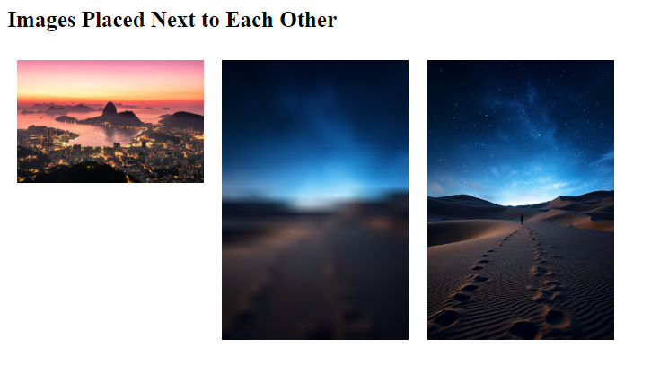
You can use the CSS `float` property to position images next to each other horizontally. Here’s an example in HTML and CSS to demonstrate images placed side by side:

```xml
<!DOCTYPE html>
<html>
<head>
    <style>
        /* CSS styles for the images */
        img{
            width: 200px;
        }
        .float-image {
            float: left; /* Float images to the left */
            margin: 10px; /* Add margin to create space between images */
        }
    </style>
</head>
<body>
    <h2>Images Placed Next to Each Other</h2>
    <img src="background.jpg" alt="Image 1" class="float-image">
    <img src="img1.png" alt="Image 2" class="float-image">
    <img src="stripes.jpg" alt="Image 3" class="float-image">
</body>
</html>
Code language: HTML, XML (xml)
```

**Output : **
![](https://blogkhanwaseem.s3.amazonaws.com/uploads/2023/09/16113311/image-116.png)

**In this example:**

- We have three `<img>` elements with the class `.float-image`.

- In the CSS, we use the `.float-image` class to set `float: left`, which makes the images float to the left. This means they will appear side by side horizontally.

- We add a margin of `10px` to create some space between the images for better readability.

When you open this HTML file in a web browser, you will see the images displayed next to each other from left to right. This demonstrates how the `float` property can be used to position elements horizontally.

These values give you control over the positioning of elements within their containers, making it possible to create various layouts and text wrapping effects in your web designs. However, it’s important to use them carefully, as improper use of floats can sometimes lead to layout issues that can be challenging to resolve. Modern CSS layout methods like Flexbox and Grid have become more popular and are often preferred for creating complex layouts due to their greater control and predictability.

### Related posts:

[CSS – Margin](https://blog.khanwaseem.com/css-margin/)
[CSS – Measurement Units](https://blog.khanwaseem.com/css-measurement-units/)
[CSS – Pseudo Classes](https://blog.khanwaseem.com/css-pseudo-classes/)
[CSS – Pseudo Elements](https://blog.khanwaseem.com/css-pseudo-elements/)

Powered by [YARPP](https://yarpp.com).
